Venue: Sandlewood Manor
Photographer: Ama by Aisha, JW Baugh Photography, Leslie Margarita Photo
Florals: F. Dellit Designs
Planner: Wed & Prosper
Rentals: Archive Rentals
Calligraphy: Danielle Williams Calligraphy
This open house was so much fun for us to design. It was a different vibe than what we do in our day-to-day, and the color palette Fawn selected was perfection. (And I typically don’t even like orange and yellow). Rachel with Wed & Prosper gave us a theme and a general idea of her vision for the ceremony space and table scape, and we went to town on some designs.
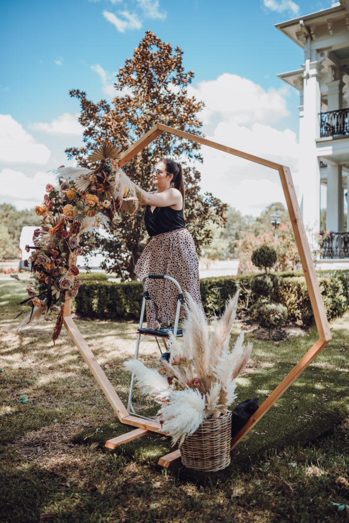
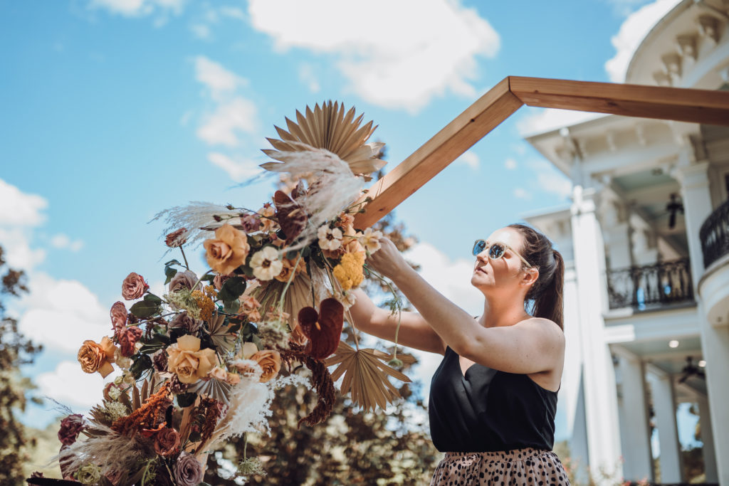
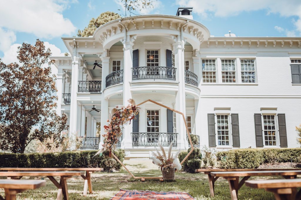
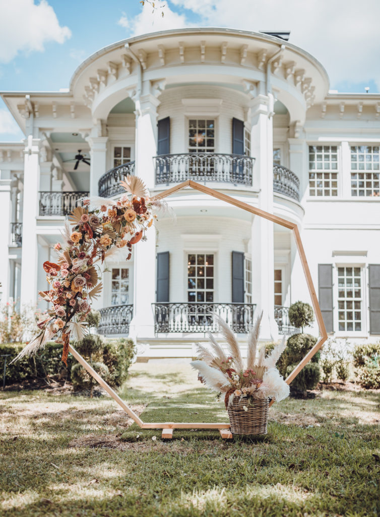
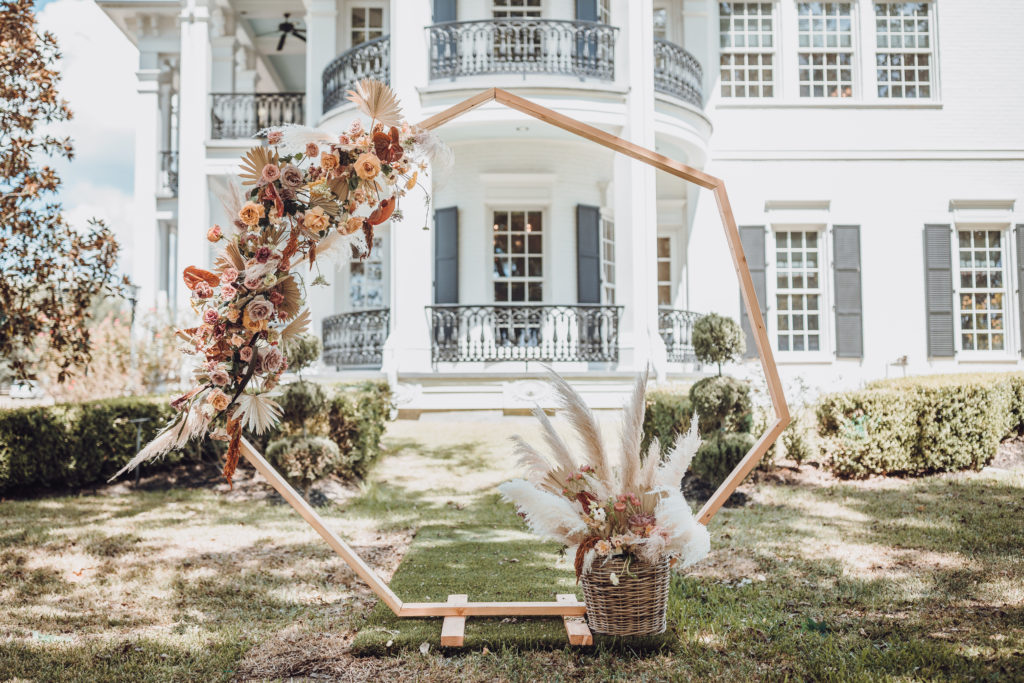
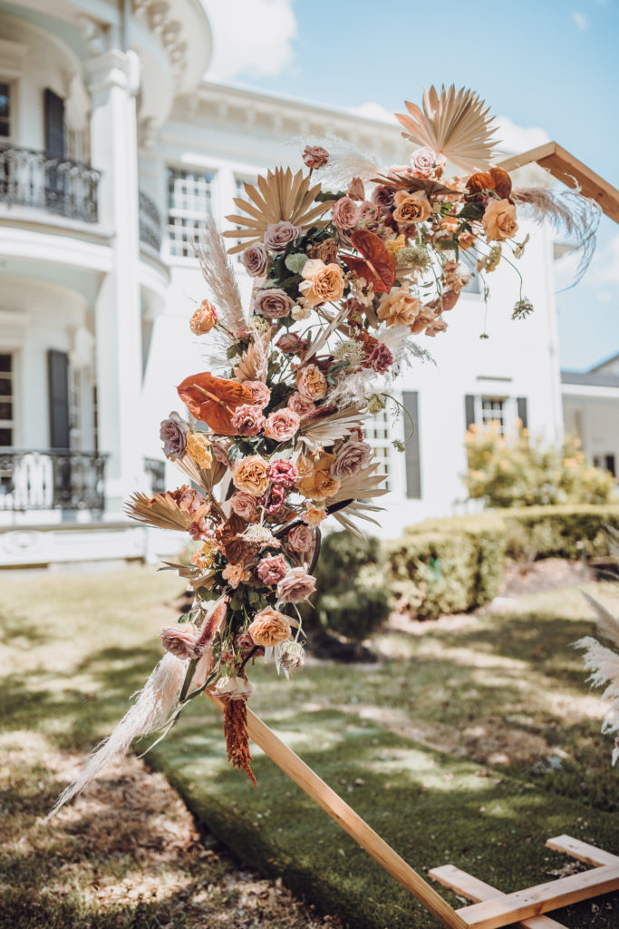
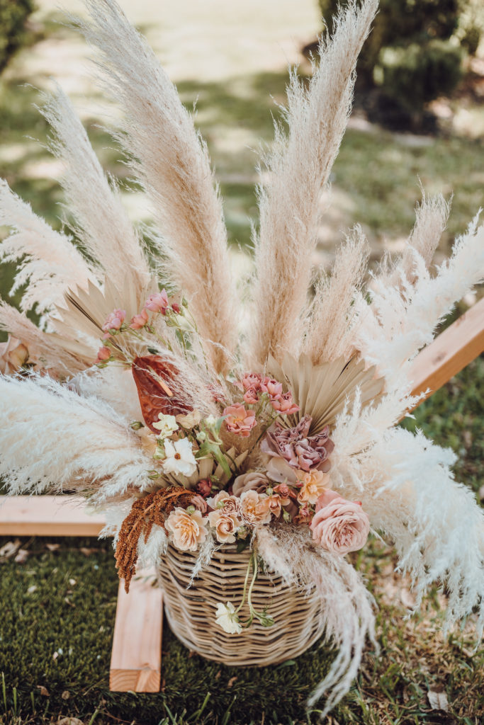
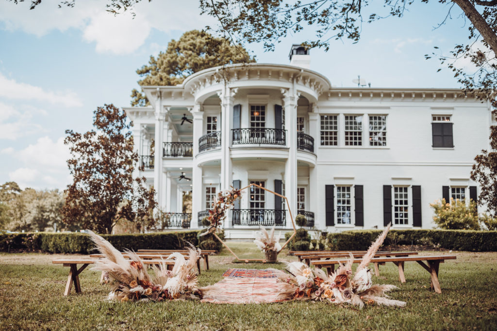
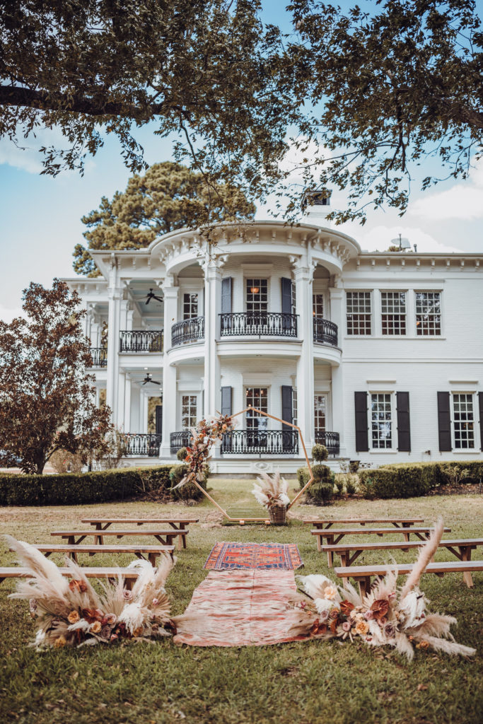
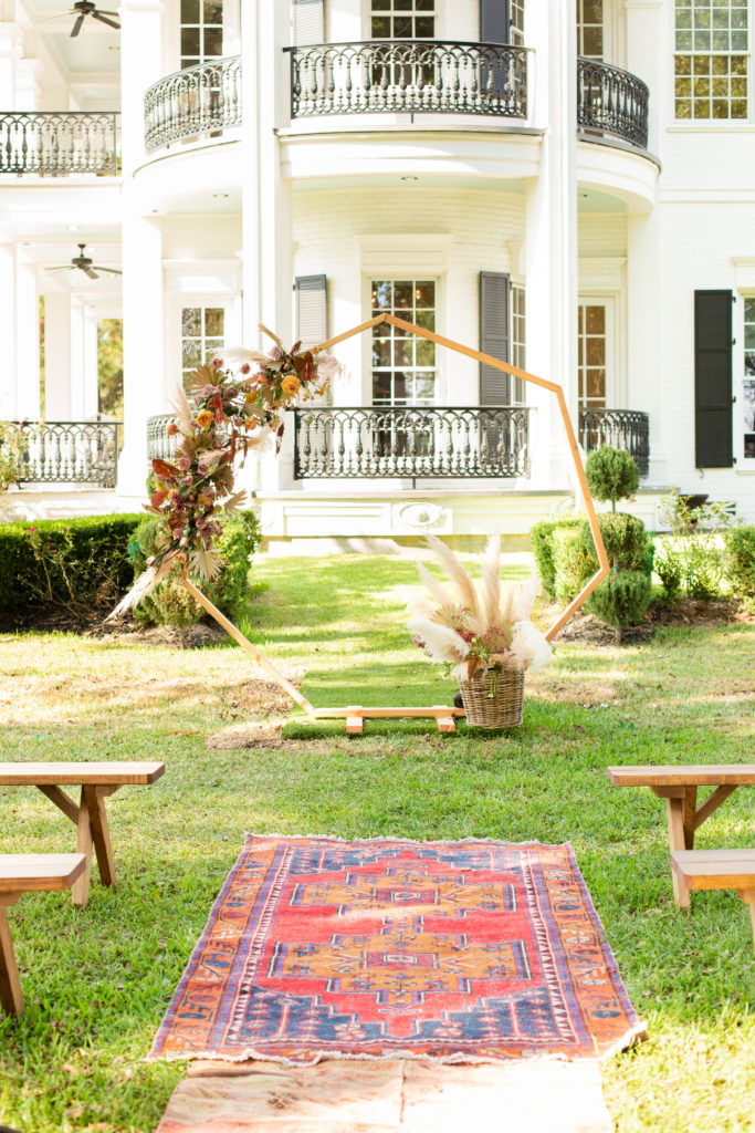
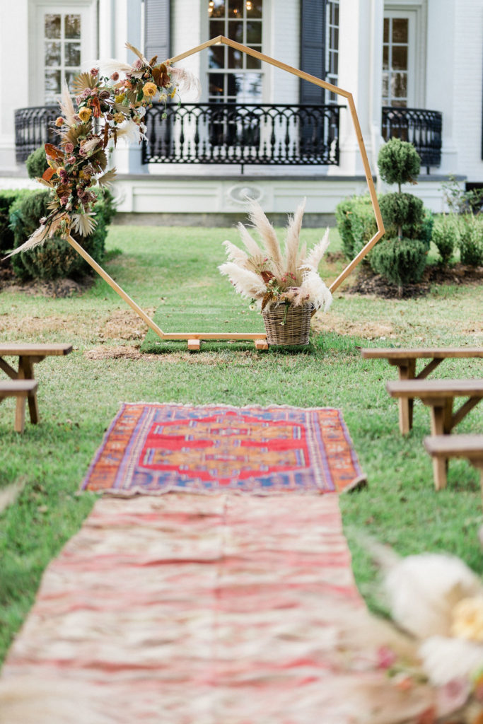
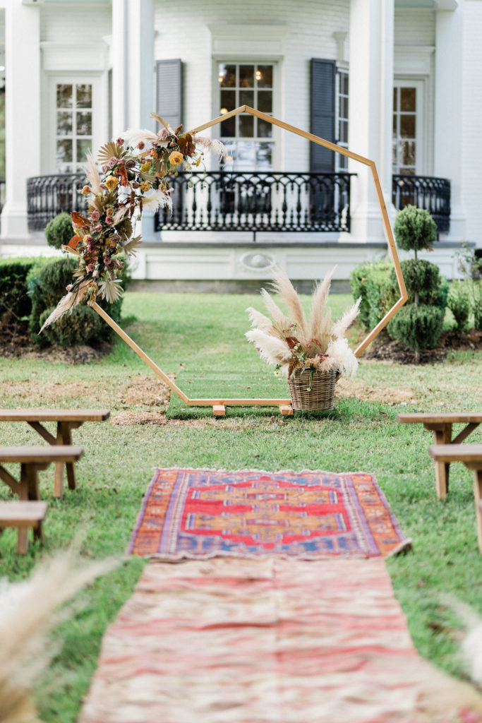
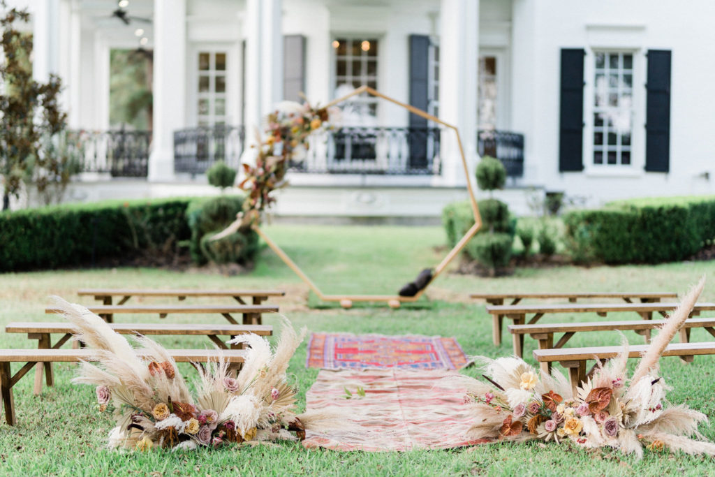
The arch was provided by Archive Rentals, who you should all check out if you know what’s good for you. We went with an offset design and a basket of pampas and floral on the ground slightly in front of the arch to balance the action up top. We had to do some sandbagging behind the basket because the arrangement on the top was so big and beautiful that it had the arch wanting to roll away. Can’t have that.
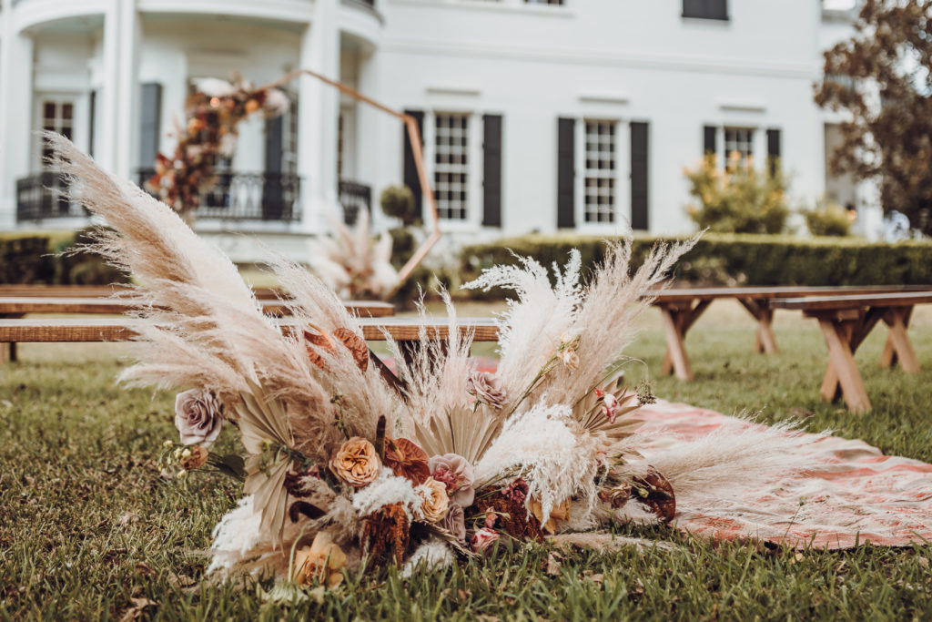
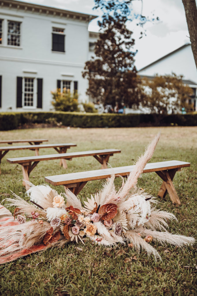
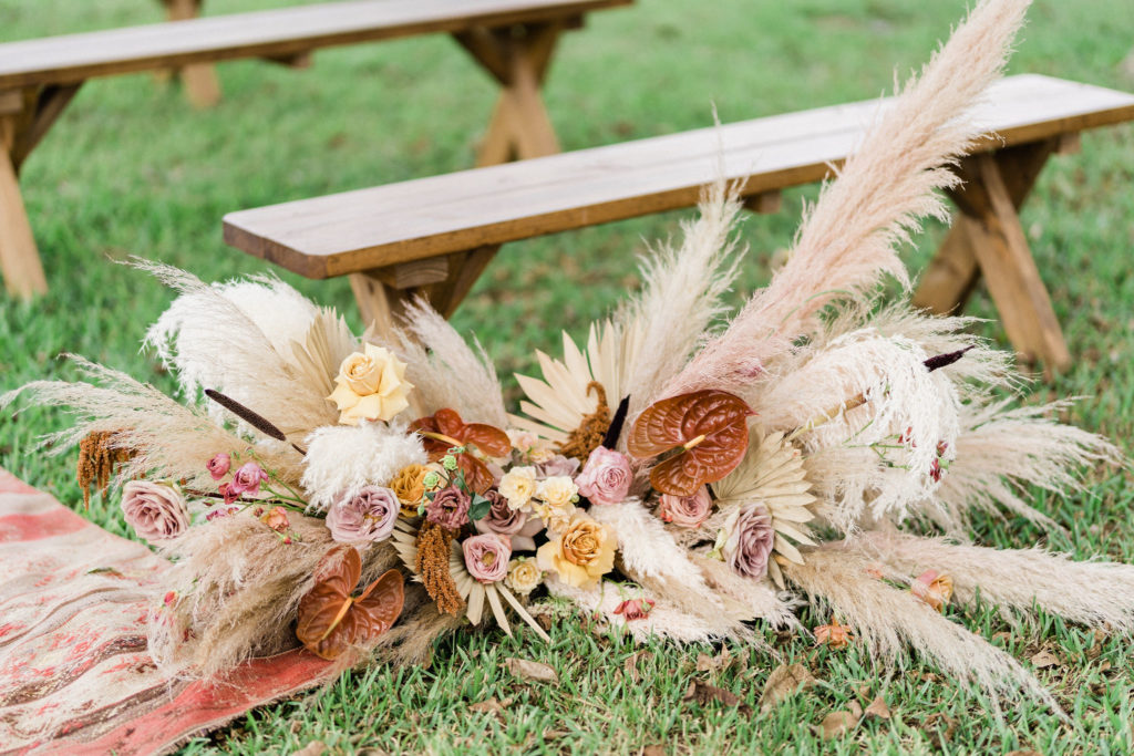
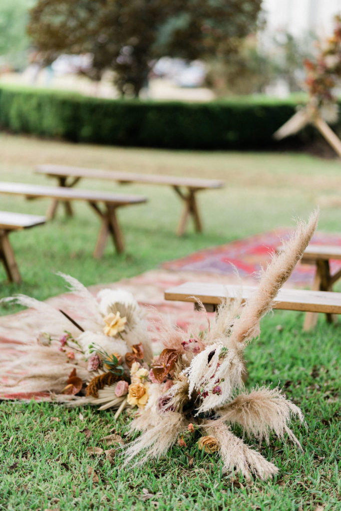
The aisle markers were designed to mirror the style of the arch arrangement, but also to make their own statement–and boy, did they do that. The reflexed mustard-colored roses are really what did it for me on those bad boys.
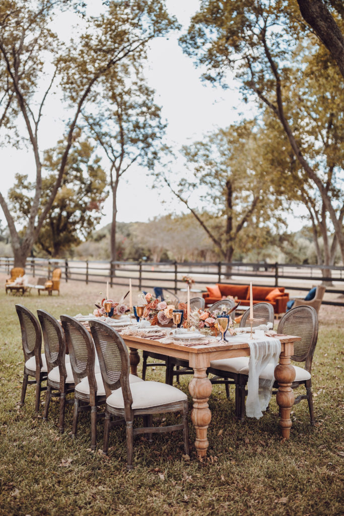
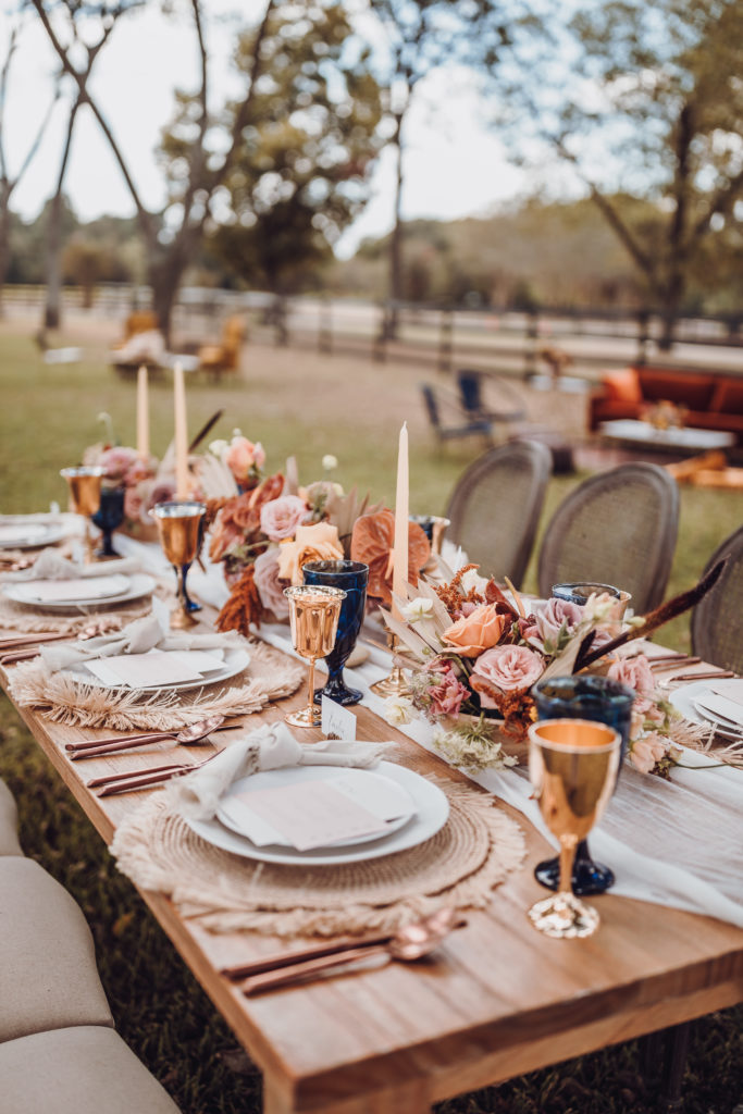
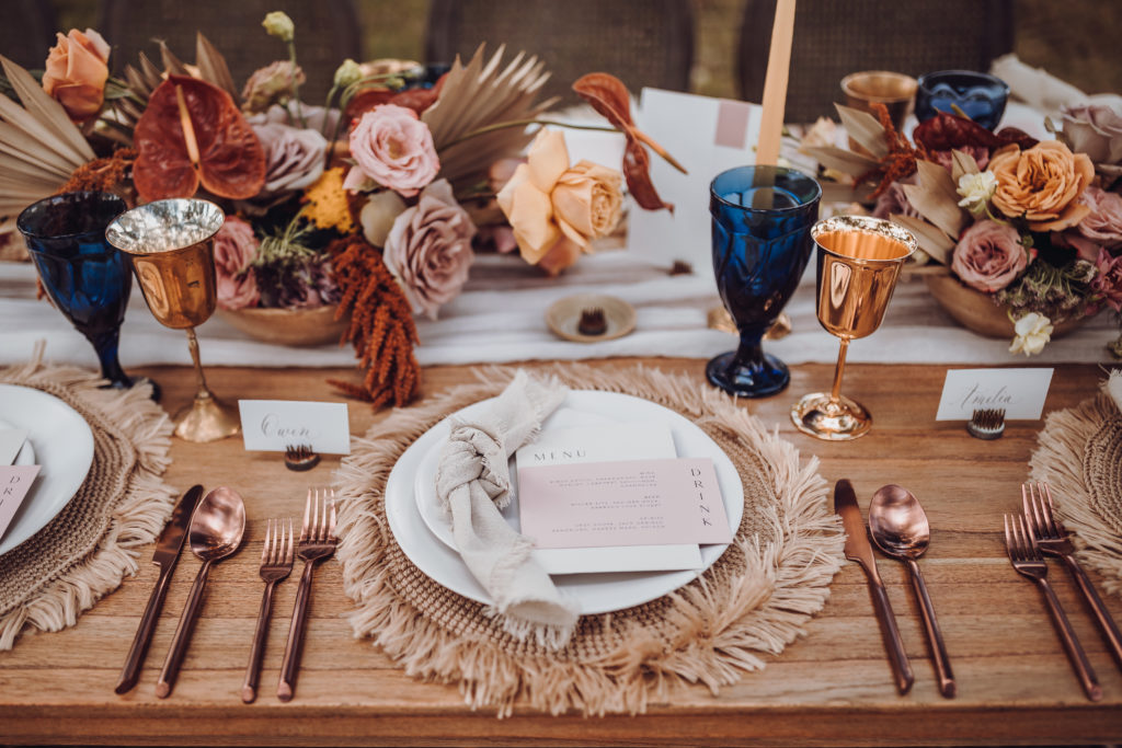
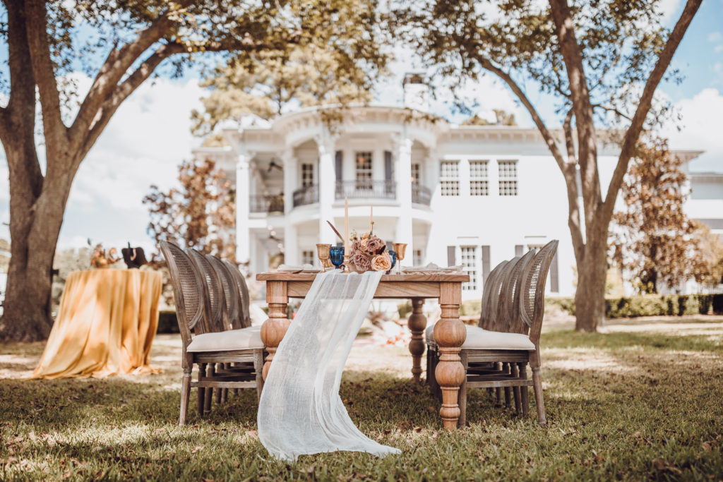
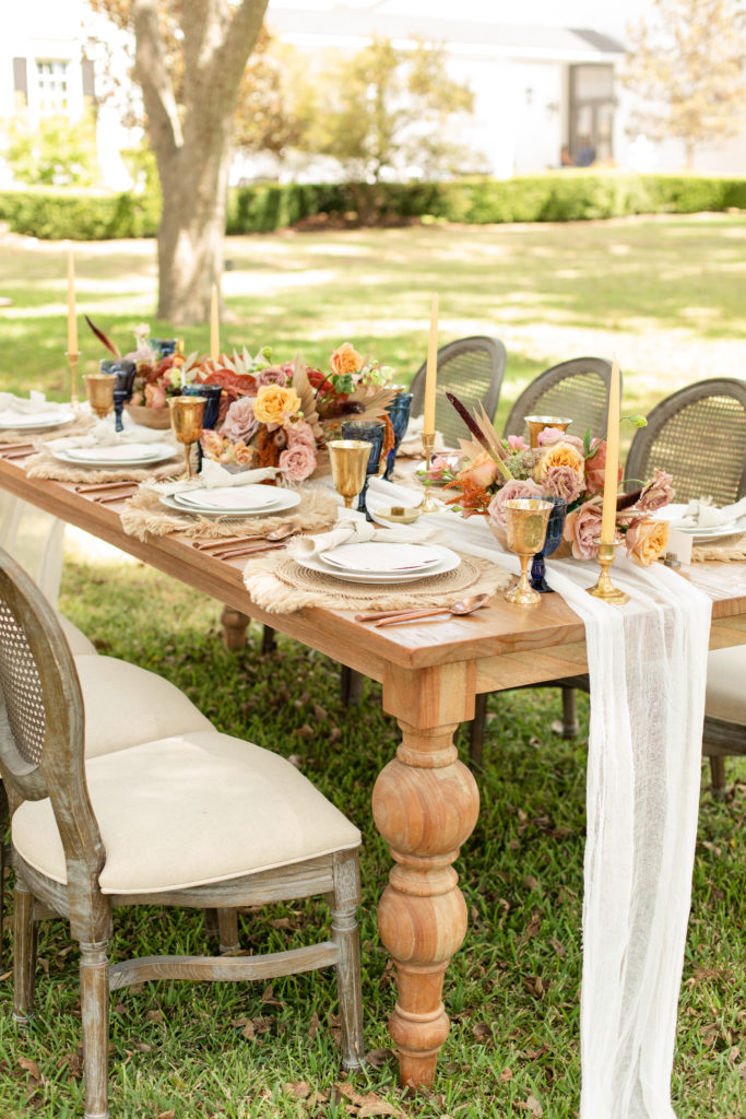
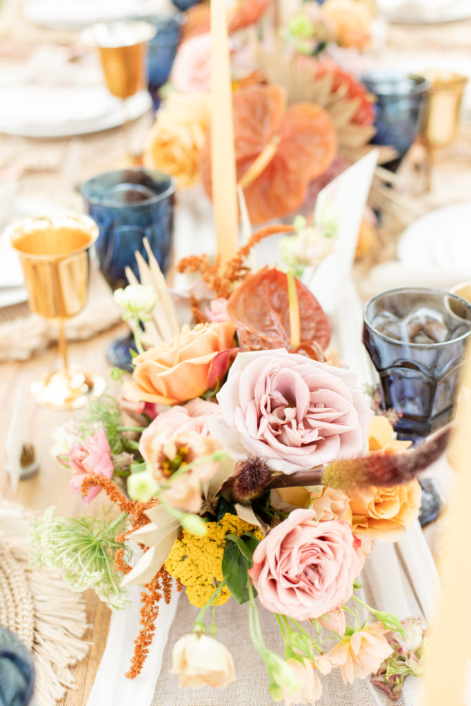
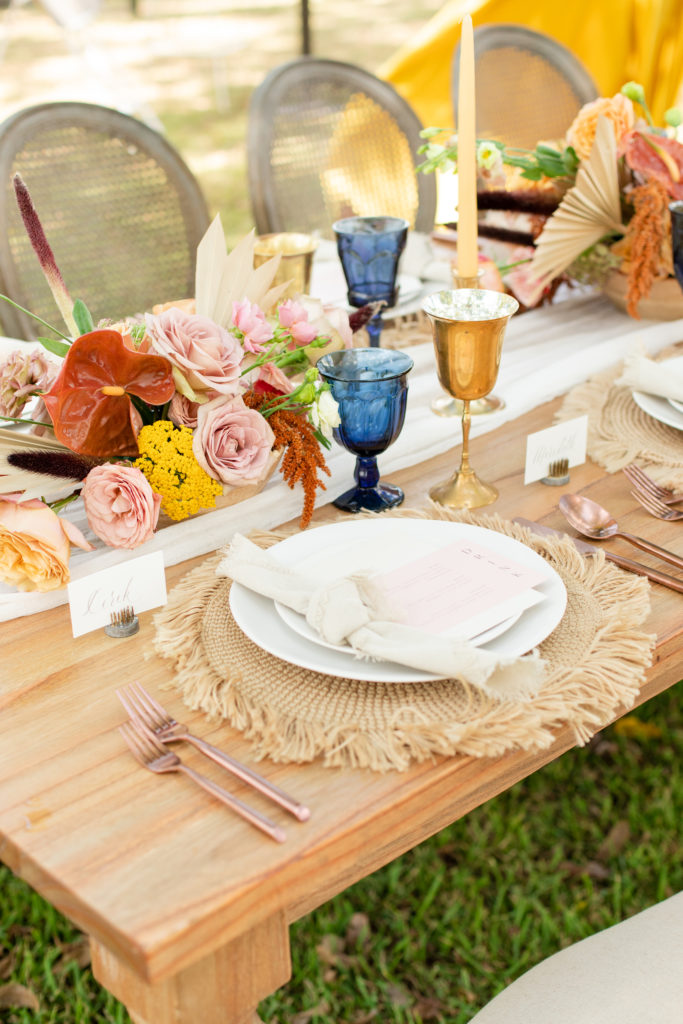
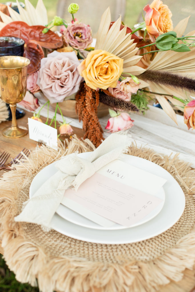
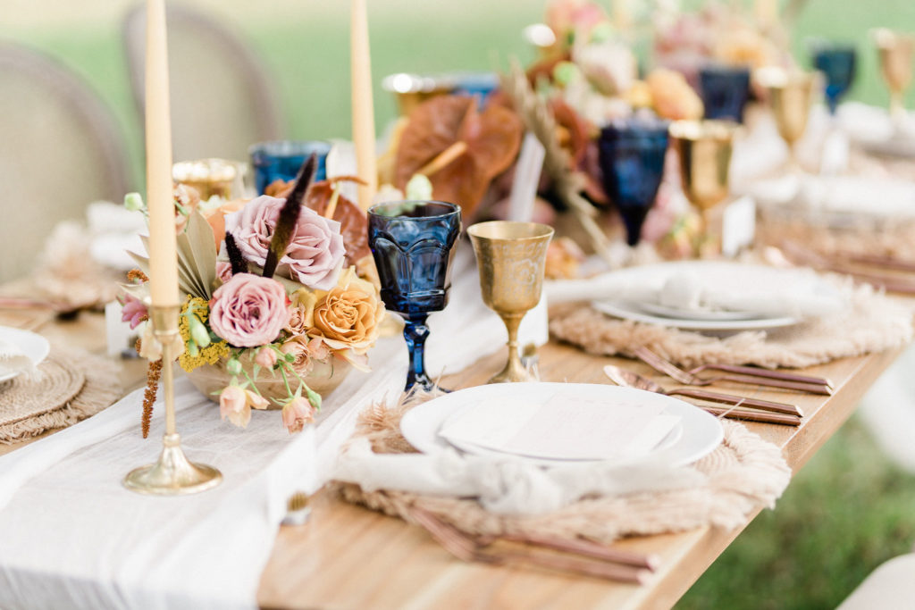
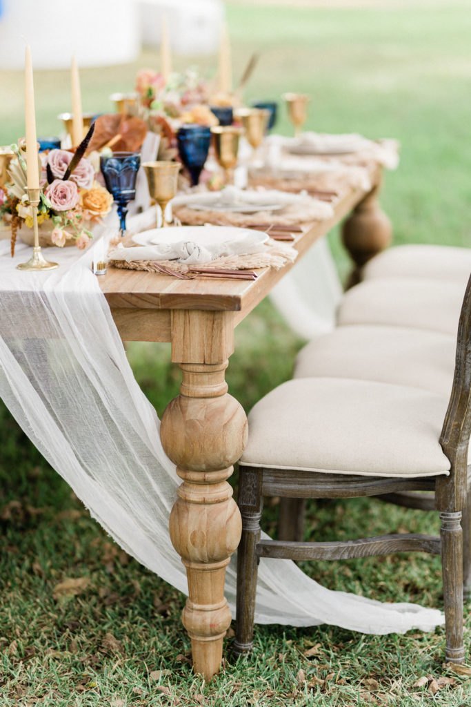
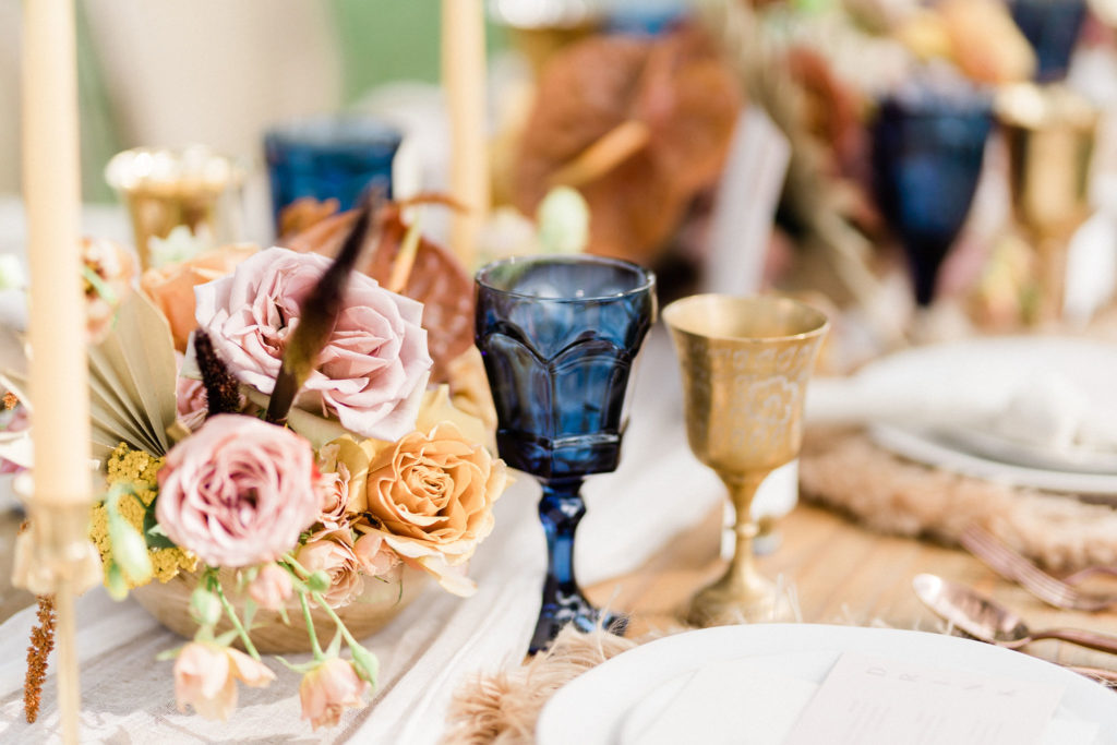
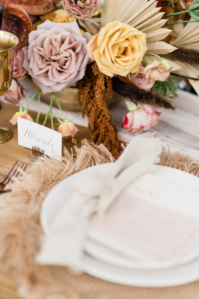
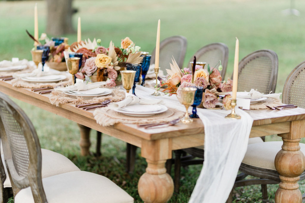
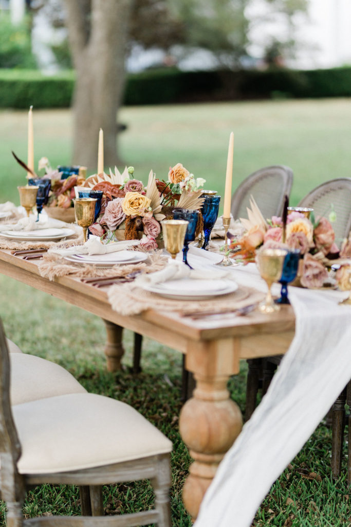
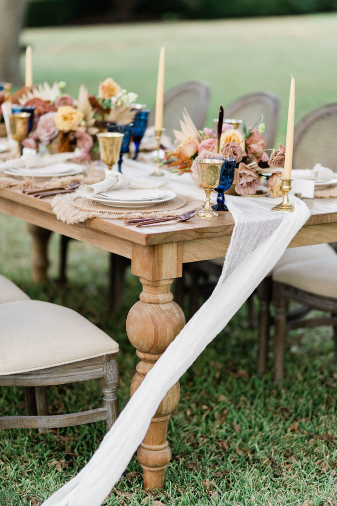
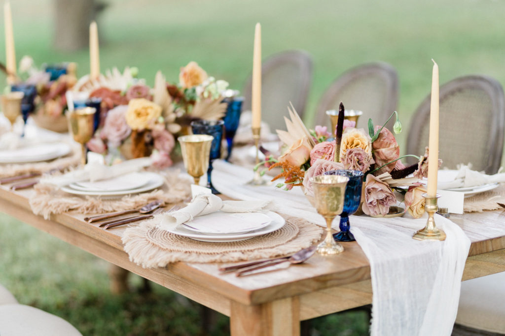
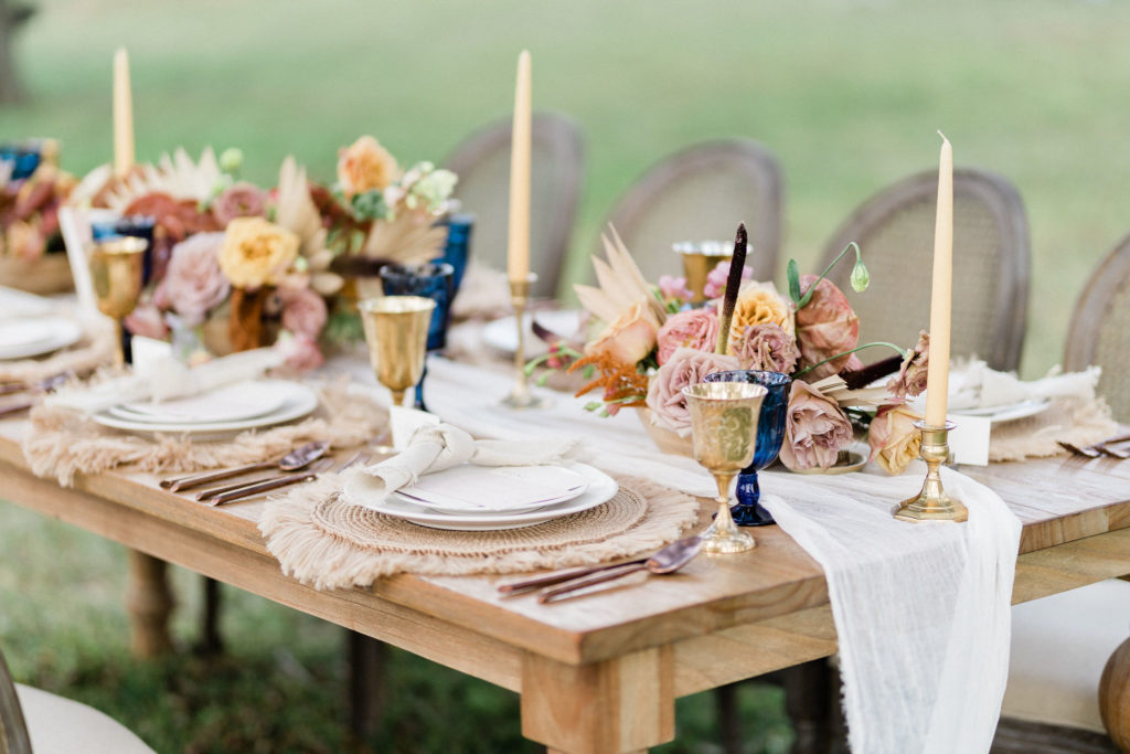
The table setting was a boho dream with rattan-style placemats and a delicate cloth table runner, creating a fun mix of textures. Danielle’s calligraphy was top-notch, and we placed the name cards in floral frogs to hold them upright. The centerpieces were designed to reflect the look and feel of the other arrangements to maintain cohesion, while still rocking their own personalities.
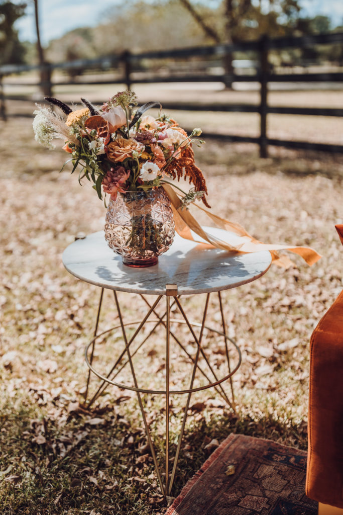
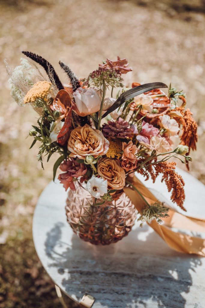
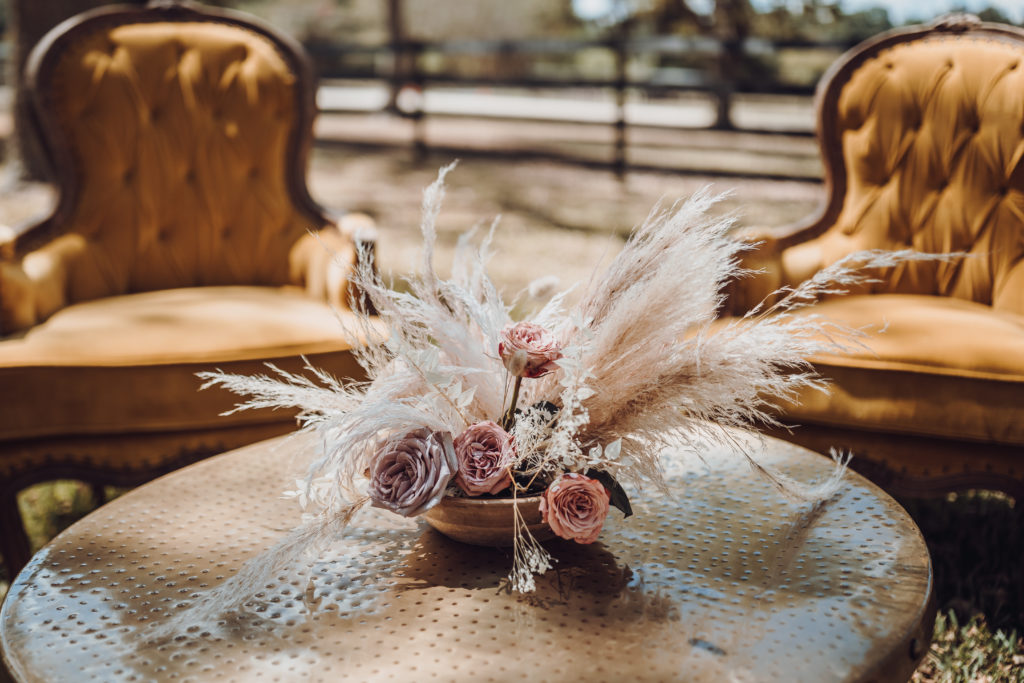
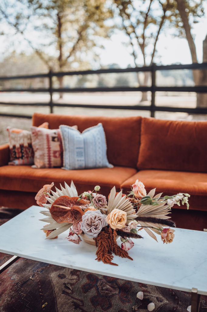
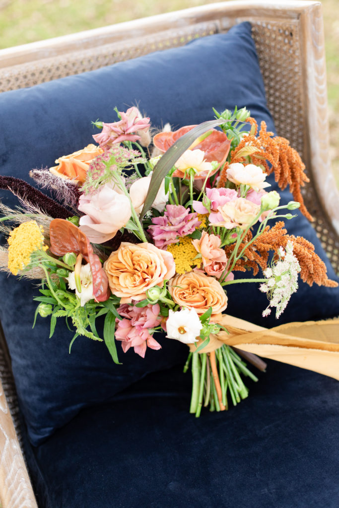
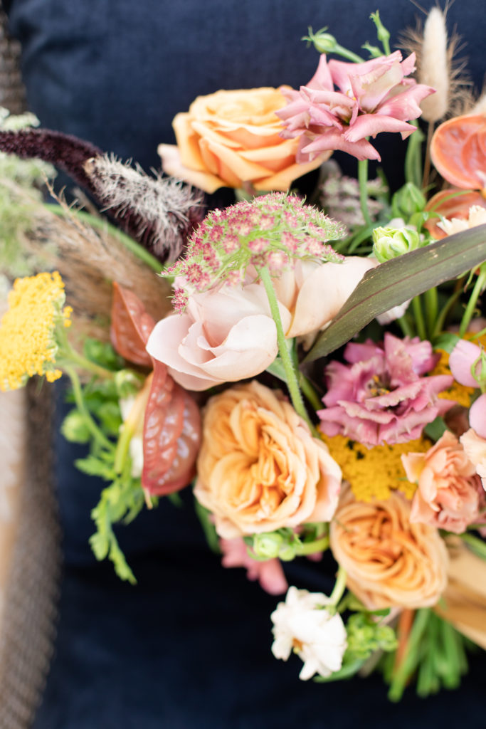
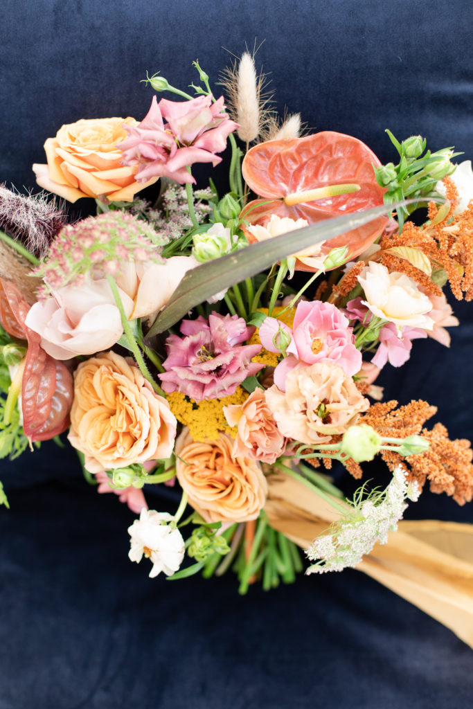
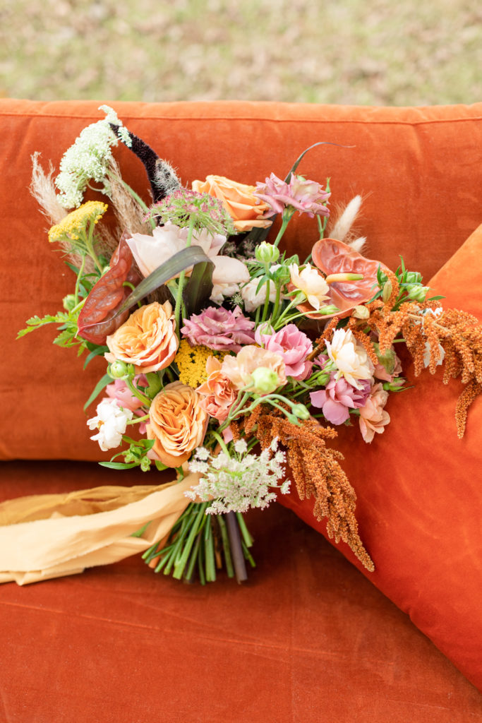
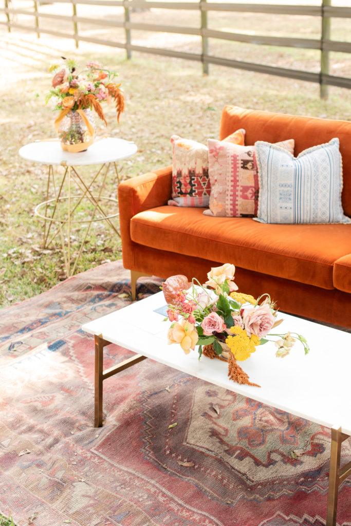
The lounge area (also supplied by Archive–did I tell you they’re good?) was styled with one of the centerpieces from the table setup, along with the bridal bouquet that Jacki created. How cool is the shape of that bouquet?!
